Box Clever is thrilled to announce the launch ROSS Door & Gate, along with two awesome refreshes. After spending numerous hours strategizing, designing, developing and copywriting, the team at Box Clever would like to show off their hard work!
ROSS Door & Gate - Launched October 2014
ROSS Door & Gate is a wholesale connection for overhead door and gate parts located in Metro Vancouver. They were in need of a website to showcase the diversity of products that they provide. To accomplish this, Box Clever created a scrolling backdrop that contained items from most of the categories of products they offer, which sits behind their brand on the homepage. Box Clever also included on the homepage an area to introduce their suppliers that is linked to the full supplier listing page. With a numerous suppliers to showcase, this design makes it easy for them to upload and display them in a clean and manageable fashion.
When consumers are looking to make a purchase, the website funnels them to contact them so that they are able to commence the excellent customer service they are known for. A fantastic new site for the industry leading ROSS Door & Gate!
The King's University - Refresh October 2014
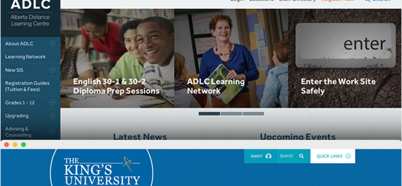
The King’s University refresh was used to modernize the design of the website, while retaining the same visual style of their previous site. The photography used throughout the site was switched from greyscale to colour in order to be more dynamic, and the size of the body text was increased to make it more clear. To increase user enjoyment and functionality on all devices the navigation was simplified so it is easier to use
To provide the user with a better understanding of King’s, the “About” section was expanded to be more impactful.
Built on Box Clever's WebGuide CMS, this refreshed site showcases exactly what The King’s University is about and what it has to offer.
To check out our case study on The King’s University, click here!
ADLC - Refresh October 2014
Soon after the initial website was launched, updated branding became available to ADLC and we knew a refresh would be in order.
To provide a more fluid design, a carousel was added to the homepage to promote news and events, and to feature important information. The web intake process was also restructured to draw focus to ADLC’s services, making the registration process more prominent. With the majority of their audience being tech-savvy, social media icons were simplified and placed on the bottom of the home page.
Overall, this refresh was made to incorporate ADLC’s new branding but in turn, the new design will improve user experience as well.
