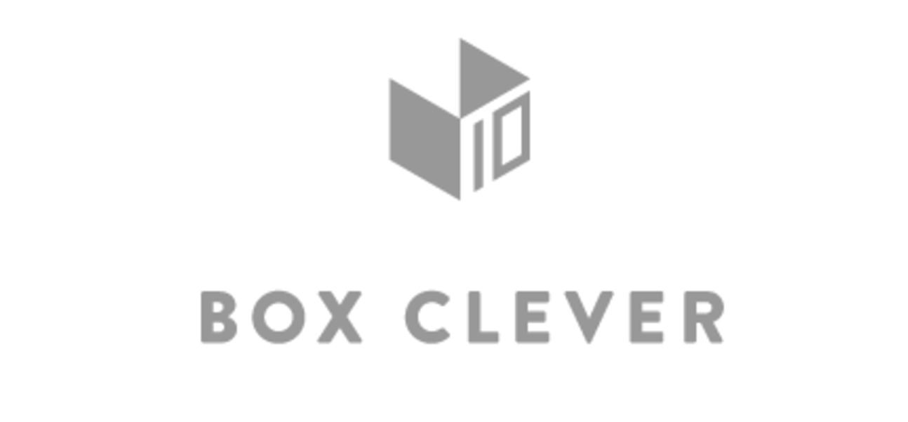
The Challenge: To create a celebratory 10 year anniversary graphic that would be attention-grabbing, making a noticeable replacement to Box Clever's standard logo without interfering with the recognition and values we’ve built over the past decade.
The Solution: We like to keep things as simple as possible. In most cases subtracting from the current branding to create a new concept is a viable solution. However, the Box Clever logo mark is so simple that subtracting from it would leave little to work with, and in this rare instance we did the opposite. Using the invisible faces of the box, we adorned our logo mark with the number 10 to symbolize this decade’s success.
The Result: Small enough to fit into our navigation, but simple enough to add more interesting elements for our social media and messaging. Over the next year, we will be implementing the ten year graphics into everything we do. We want to express how grateful we are for ten years of great clients, great projects and amazing growth.
A lot of thought went into designing our 10 year logo - check out our case study to view the work behind our final logo!
